Tri-K
Land management in Tennessee.
(Client)
Tri-K
(Year)
2025
(Services)
Branding

Family
& Future.
Tri-K is a family owned land management company in Tennessee.
This family owned business was looking for branding that would look relevant for the field that they are in but also stand out.
The business owners have three children and have a last name that starts with a K. So the name "Tri-K" pays homage to their family values.
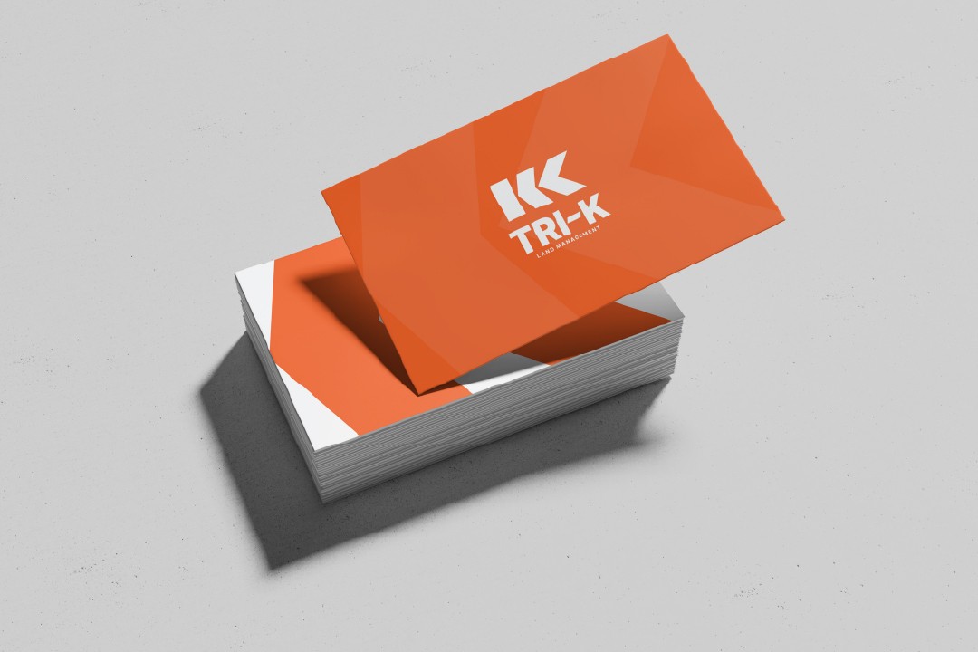
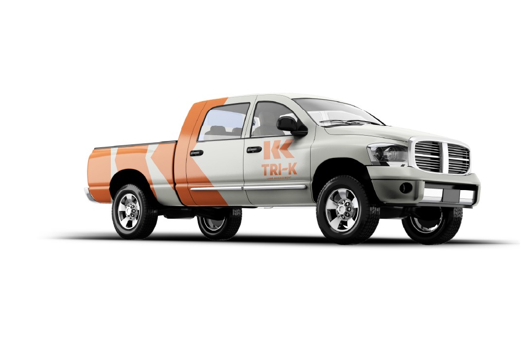
When researching for this logo I knew we needed something that appeared "construction work-y" but also stood out from the rest of their competitors.
In the end I was able to deliver a logo that did just that. A solitary K, made out of three parts to represent their family. I was also to hide the silhouette of the state of Tennessee in the dash for a nod to where the business is located.


Tri-K
Land management in Tennessee.
(Client)
Tri-K
(Year)
2025
(Services)
Branding
Family
& Future.
Tri-K is a family owned land management company in Tennessee.
This family owned business was looking for branding that would look relevant for the field that they are in but also stand out.
The business owners have three children and have a last name that starts with a K. So the name "Tri-K" pays homage to their family values.
When researching for this logo I knew we needed something that appeared "construction work-y" but also stood out from the rest of their competitors.
In the end I was able to deliver a logo that did just that. A solitary K, made out of three parts to represent their family. I was also to hide the silhouette of the state of Tennessee in the dash for a nod to where the business is located.
Tri-K
Land management in Tennessee.
(Client)
Tri-K
(Year)
2025
(Services)
Branding
Family
& Future.
Tri-K is a family owned land management company in Tennessee.
This family owned business was looking for branding that would look relevant for the field that they are in but also stand out.
The business owners have three children and have a last name that starts with a K. So the name "Tri-K" pays homage to their family values.
When researching for this logo I knew we needed something that appeared "construction work-y" but also stood out from the rest of their competitors.
In the end I was able to deliver a logo that did just that. A solitary K, made out of three parts to represent their family. I was also to hide the silhouette of the state of Tennessee in the dash for a nod to where the business is located.